What happened to the Baltimore region's middle class neighborhoods? A study from the "US2010" project says they were replaced with rich and poor neighborhoods.
In 1970, two-thirds of Americans lived in "middle-income" neighborhoods, according to the study. As those neighborhoods declined by 32 percent, the proportion of both poor and affluent neighborhoods doubled.
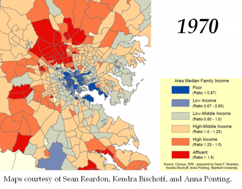
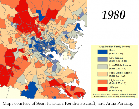
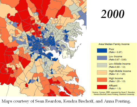
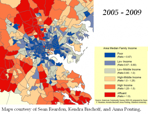
The study says Baltimore ranks 18th in the nation for income segregation. You can see income segregation grow in the animated map above, which we created using maps generously provided by researchers Sean Reardon, Kendra Bischoff, and Anna Ponting.
The dark colors represent the extremes: blue for poor neighborhoods, and red for affluent ones. The lighter blues and grays and oranges represent middle-income neighborhoods. In 1970, reds and blues dot the landscape. By 2009, they dominate.
Why have middle-income neighborhoods disappeared? It's not just that the middle-class has disappeared and we don't need them anymore. It's also that more Americans are sorting themselves by income--you're just less likely to see upper-income families in middle-income neighborhoods.
On Friday, we'll talk to researcher Sean Reardon and to Jennifer Arndt Robinson, who has decided to stay in a neighborhood near Patterson Park even though her family could afford to "move out to the county."
UPDATE: Gif-haters and map...enthusiasts, we hear you. Below are links to all five original maps. And here's the audio from today's episode. The reporting in the episode was driven by the maps.


