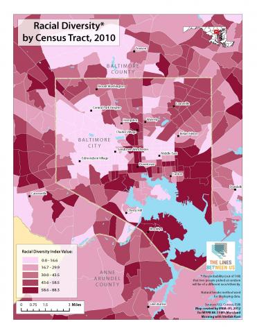
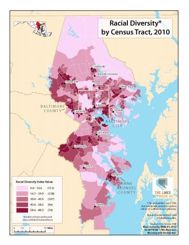
The Baltimore Neighborhood Indicators Alliance has partnered with WYPR to create maps of both the city and the wider region for education, employment, and other outcomes. Today, we wanted to share one of those maps with you.
This is a map of racial diversity. The darker the shading, the more racially diverse an area is. It's an interesting way of measuring diversity: if you picked two people at random from the given statistical area, it's the probability (from 0 to 100) that they'd be of different races. There's a map for Baltimore City, and one for the city plus Baltimore and Anne Arundel counties. Feel free to download these maps and share them any way you like--you can click on them to download the pdf versions.
How does this square with the way you see your neighborhood? Are you surprised?
Send us your thoughts at [email protected], by voicemail at 410-881-3162, on our Facebook page, or at our Twitter account.